This documentation is meant for version 6 of Astro.
For version 7, please visit www.astrouxds.com.
Button
Action Buttons allow users to trigger actions by clicking, tapping, or pressing a corresponding key on a keyboard, such as the “Enter” key.
Rules of Thumb
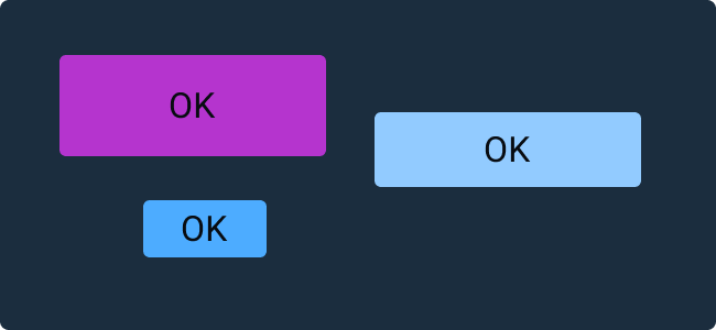
- Use only predefined Button colors, sizes and fonts — don’t customize or alter them.
- Don’t design elements which look similar to Buttons but act differently. Buttons are actionable elements.
- Don’t activate Pop Up Menus from Buttons.
- Buttons within the same group should be the same size. Use the width of the widest Button.
- Space Buttons evenly.
- Clearly title Buttons by choosing a verb that describes the action the user performs at precisely the moment the Button is clicked: “Save, Close, Print, * Delete, Change Password,” etc.
- Resize Button width to accommodate the title; do not abbreviate or truncate Button titles.
- Don’t use an outside label to introduce a Button. Instead, clearly title the Button.
- Add an ellipsis (…) to the Button title if it opens another window, Dialog Box or app.
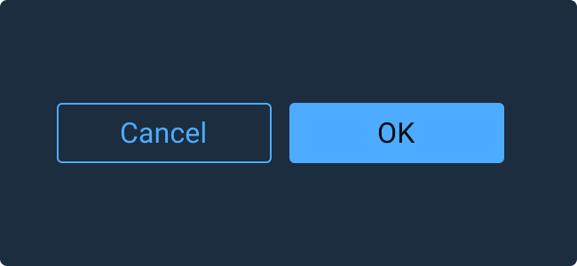
- In Button groups, the primary Button with the preferred user action shall be placed on the right and all Buttons with secondary actions to the left of the preferred action Button.
- Position Buttons consistently across the application. Unless there is a good reason not to, right-align Buttons in Astro applications.
Outline Button
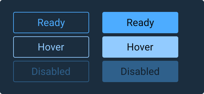
Outline Buttons are an alternative Button style to be used in situations where a de-emphasized Button is beneficial in guiding the user to a preferred option. For example, use an Outline Button for the less preferred option in Ok/Cancel Button pairings.
Examples
