Status System
Consistent use of colors and symbols to convey status is critical for user success.
Astro's user research, conducted on a wide variety of space applications, showed that inconsistent and unconstrained use of colors and symbols left users confused and even dismissive of color systems. The research further showed that wide overuse of red to indicate both "off" and "emergency" stripped the color of its attention-getting power.
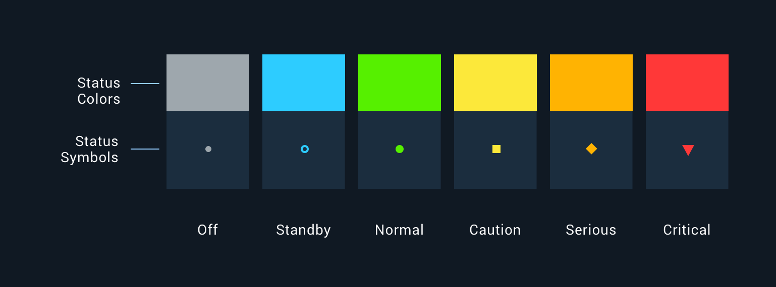
The Astro Status System is a standard to consistently indicate the state of an object or concept (typically represented by an Icon). The Status System consists of Status Symbols and Status Colors.
The Status Color palette for the Status System is based on a color temperature scale. The lowest level of severity, Off, is grey (neutral) and the highest level of severity, Alert, is red (hot).

Each Status Symbol is a combination of a Status Color and a shape. The shapes are provided to ensure people with color blindness can also clearly identify the state of the object or concept
Rules of Thumb
- A state change must be reflected by a change in the Status Color and, if appropriate, the Status Icon.
- Only use the standard set of Status Symbols and Status Colors provided.
- Use the highest level of urgency status if multiple statuses are consolidated. For example, if the statuses of underlying components are green, yellow, and red, the consolidated indicator is red.
- Reserve red for states that are urgent and require immediate attention.
Status Colors
| Hex | RGB | CSS | Synonyms | |
|---|---|---|---|---|
 |
#ff3838 | 255,56,56 | --colorCritical | Critical, alert, emergency, urgent |
 |
#ffb302 | 255,179,2 | --colorSerious | Serious, error, warning, needs attention |
 |
#fce83a | 252,232,58 | --colorCaution | Caution, unstable, unsatisfactory |
 |
#56f000 | 86,240,0 | --colorNormal | Normal, on, ok, fine, go, satisfactory |
 |
#2dccff | 45,204,255 | --colorStandby | Standby, available, enabled |
 |
#9ea7ad | 158,167,173 | --colorOff | Off, unavailable, disabled |
Avoid adding additional colors if possible. Creating additional colors greatly reduces the user’s ability to learn and properly use the application.
