GRM Dashboard
The images depicted on this page use the color palette and fonts from Astro 4. All new projects should use Astro 5 colors and fonts to be considered an Astro application. Refer to this section for general user experience guidance only, not visual design guidance.
Launch GRM Dashboard Sample App | Design Materials and Source Code
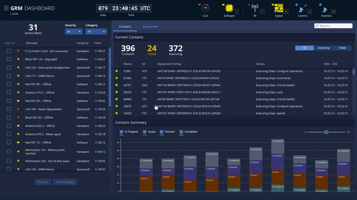
Given the large number of satellite contacts and equipment assets that operators are responsible for, maintaining situational awareness poses a significant challenge. Operators must be able to quickly identify equipment issues and resolve them so that there are no missed opportunities to communicate with satellites. The GRM Dashboard app was designed with this goal in mind. As the operators’ primary GRM app, it would constantly occupy one of their large displays.
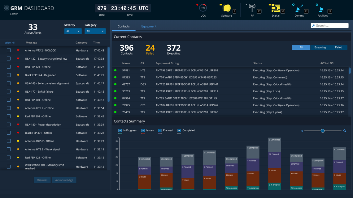
There are three main areas of the GRM Dashboard app: the Global Status Bar, the Alerts pane, and a tabbed content area that displays either the Contacts page or the Equipment page. The key elements are described below, but you can find much more design and task flow detail in the GRM Design Specifications and Wireframes documents. You can also launch the GRM Dashboard Sample App to explore the design interactively.
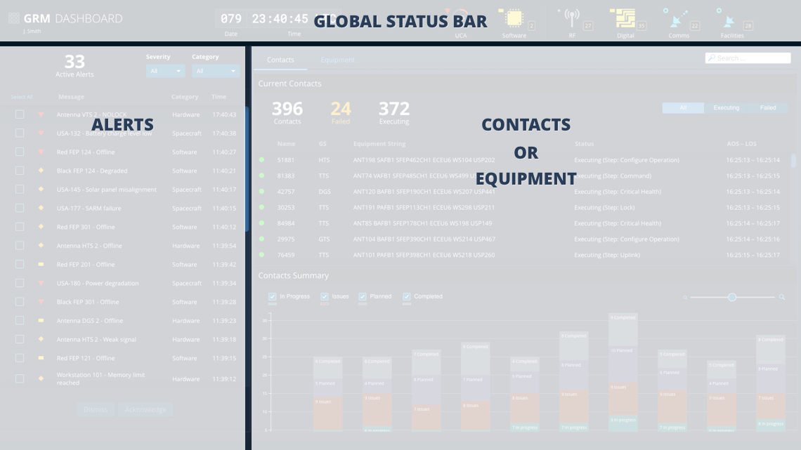
Global Status Bar
As outlined on the About GRM Designs page, each of the apps in the GRM Suite is designed to occupy its own browser window, allowing operators to focus on the task at hand. But by virtue of being integrated into a suite, the apps share common functionality, such as a single login. Much of the shared functionality is provided in the Global Status Bar, an Astro component featured in all three apps. Though the status bar contents vary somewhat between apps in order to best support each app’s individual workflows, all contain a Clock, Monitoring Icons, and an App Switcher Menu that allows operators to transition quickly from one GRM task flow to another.

- App Switcher Menu - The App Switcher Menu allows the user to launch new instances of different GRM apps, sign in/sign out, and edit preferences.
- Global Clock - Time is central to many GRM service task flows, so it is included in the Global Status Bar in all GRM apps.
- Monitoring Icons - The Dashboard app includes Upcoming Contacts Allocated (UCA) and Software status indicators, as well as status and alert counts for each of the top categories in the equipment hierarchy.
Alerts
The Alerts panel provides operators with a roll-up of issues across the ground system, satellite vehicles, and satellite subsystems. Operators can filter the alerts by Severity and Category, allowing them to quickly identify the most critical issues or focus in on particular areas of the global system. This allows operators to efficiently track their workflow and keeps the Alerts panel more sparsely populated, so they’ll be more likely to notice when new alerts come in.
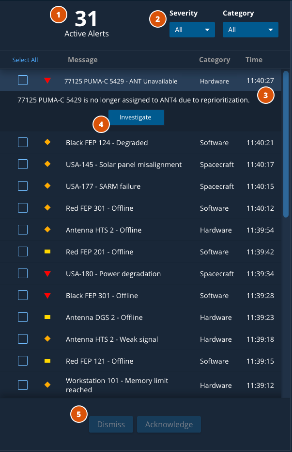
- Active Alert Hero Number - Shows number of active alerts at a glance.
- Filter Select menus - Filters alert list by severity and category.
- Expandable List Items - Expands to show alert details and call-to-action (if applicable).
- Investigate - Sends operators to a page with full alert details and actions for resolving the alert.
- Acknowledge/Dismiss - Acknowledges or dismisses alerts.
Contacts
The Contacts tab allows operators to view all contacts configured in the GRM app. Contacts can be filtered by status to allow operators to quickly identify those that failed or are currently executing. The contacts are displayed in the table along with important information such as Ground Station, Equipment String, and AOS/LOS times, but can also be expanded to present additional detail. The Contacts Summary at the bottom provides operators with a view of contact counts over time, color coded by status.
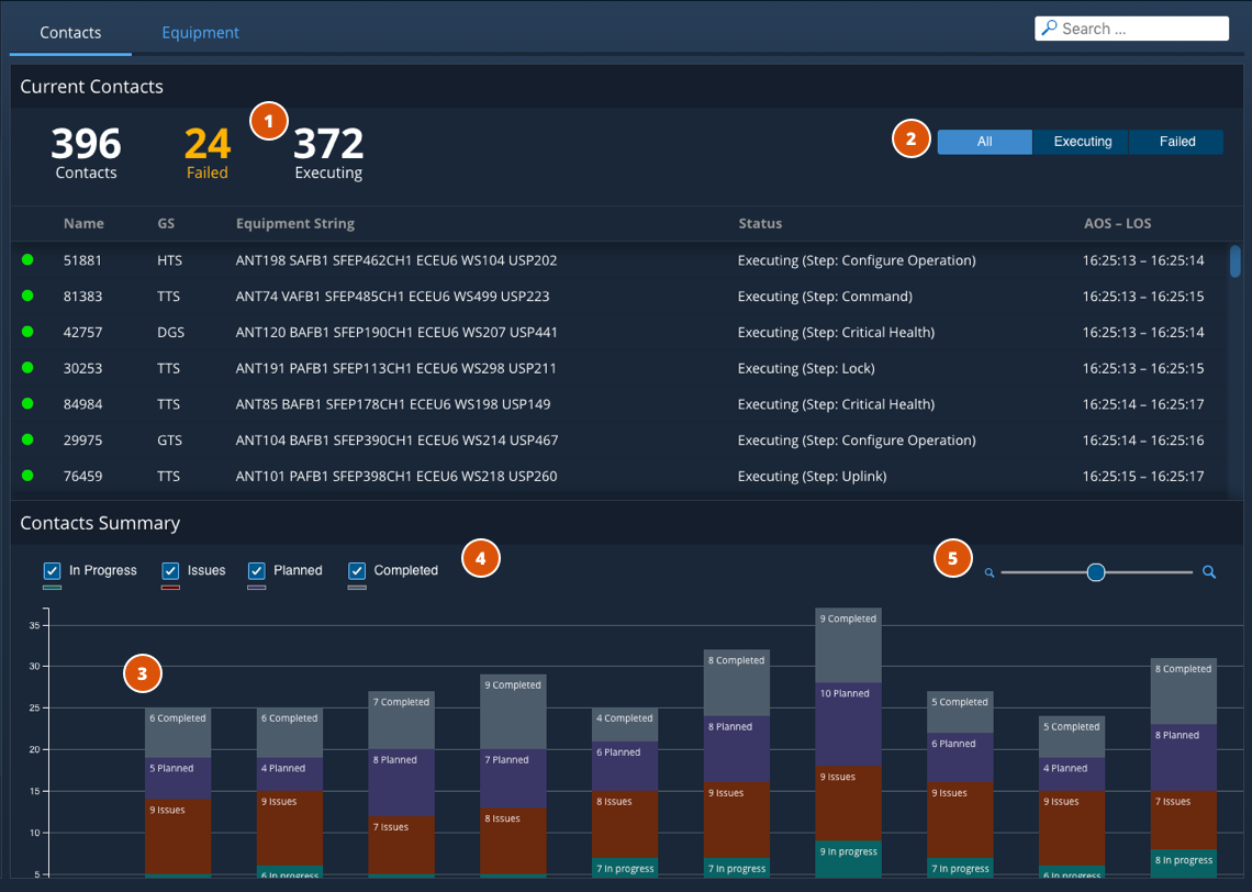
- Contacts Hero Numbers - Shows number of executing contacts at a glance.
- Segmented Button Filter - Filters Current Contacts by All, Executing, or Failed.
- Histogram - Y-axis measures contact counts, while the x-axis represents time.
- Histogram Filters - Filters may be applied to one, many or all of the Contact States; Upcoming, Executing, Complete, Failed.
- Zoom Control - Operators can drag the slider to zoom in or out of the Histogram
Equipment
The Equipment tab provides operators with a usage summary of the major equipment categories in their ground systems. At a glance, operators can see overall what the current percentage of the equipment is in use, idle or inoperable. This data will help operators identify shortages in particular areas or be used to develop contact schedules that drive more efficient equipment utilization. In addition to the current snapshot displayed in the donut charts at the top of the panel, operators can also view how this data has trended over time at the bottom of the panel.
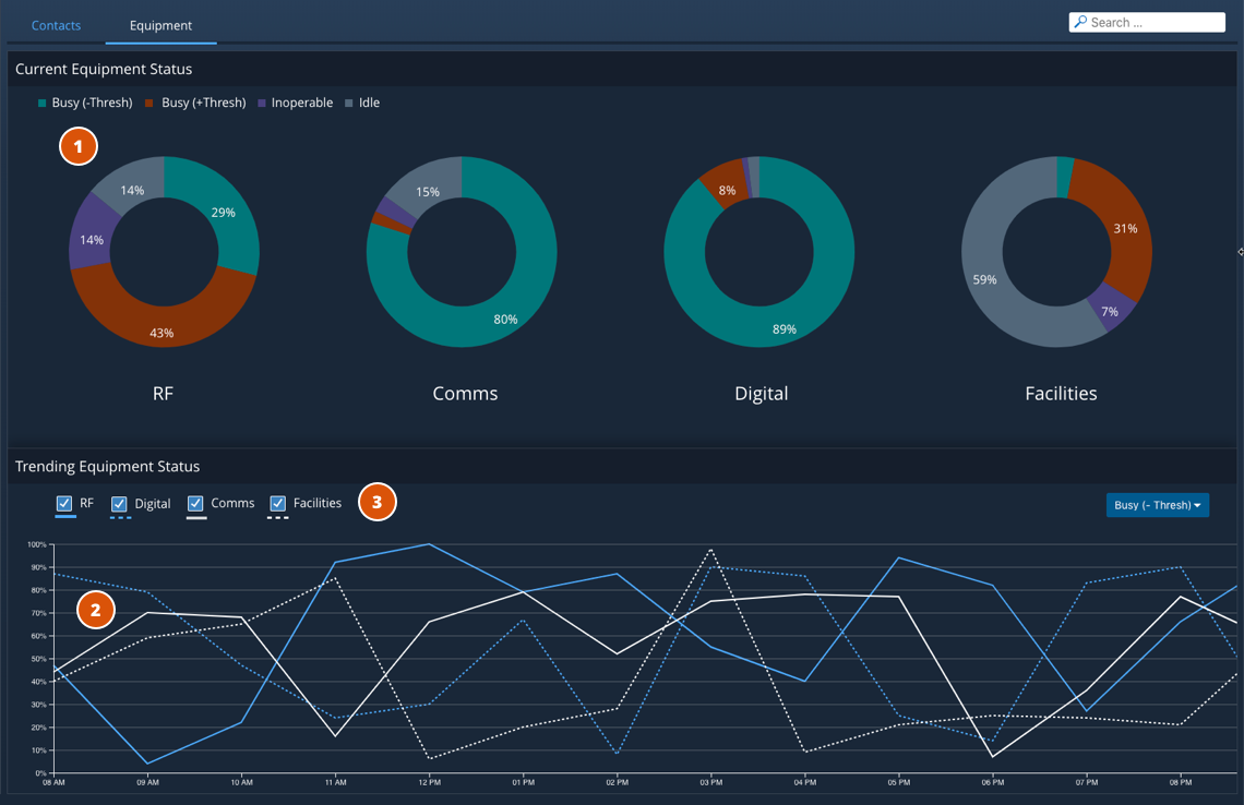
- Equipment Allocation - Shows percentage of usage across top line categories at a glance.
- Line Chart - Y-axis displays percent of equipment in a given category allocated and x-axis represents time. A “Usage Threshold” value may be defined to identify equipment that exceeds this limit.
- Trending Equipment Status Filters - Filters may be applied to one, many or all of the equipment categories defined.
Alert Details
If operators choose to drill into an alert via the Investigate button in the Alerts panel, an Alert Details page is displayed in the main content area. The content of the page changes somewhat depending on whether the alert pertains to a contact or a piece of equipment, but each variant allows operators to view additional detail on the alert, dismiss, acknowledge it, or take some action to remedy it. The image below shows an example of the Alert Details page for a contact-related alert; you can find information on the equipment variant along with relevant task flows in the GRM Design Specifications and Wireframes documents.
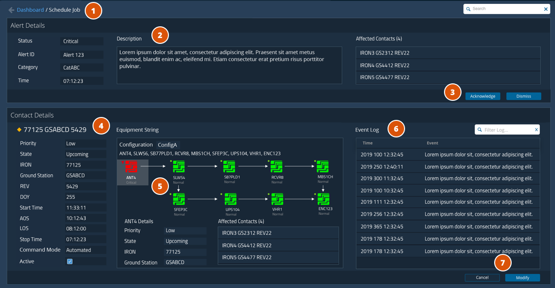
- Breadcrumb Navigation - returns the user to the Dashboard view.
- Alert Details - contains information relevant to the particular alert.
- Acknowledge/Dismiss - operators can acknowledge or dismiss the alert.
- Contact Details - because the alert in the example above is related to a contact, information relevant to that contact is displayed here.
- Status Information - in this example, the equipment string indicates that an antenna is in a critical status for this contact.
- Event Log - displays the events leading up to the alert, which could be useful in troubleshooting.
- Modify Button - puts the contact in an editable mode to allow operators to resolve the issue, in this case by modifying the Equipment String.
UX Research Findings
Task Flow Example - Modify Equipment String
Below is an animated walkthrough of a representative task flow using the GRM Dashboard app. In this flow, the operator notices a critical alert for an upcoming contact, investigates it via the Contact Alert Details page and then resolves the issue by selecting an alternative piece of equipment to use for the contact.
Design Materials and Source Code
Below are design and development resources to get you started on an app that supports GRM services. Note that there are some discrepancies between the design documents and the GRM Dashboard Sample App due to design improvements that were introduced late in the app development cycle.
| Resources | Description |
|---|---|
| GRM Design Specifications (pdf) | The GRM Design Specification contains information on use cases, task flows, UX research and wireframes for key features of the GRM App Suite. |
| GRM Design Wireframes (pdf) | The GRM Design Wireframes document contains the complete set of wireframes (mid-fidelity renderings) of the screens designed for the GRM App Suite. |
| App Source Code (Git Repository) | The source code Git repository and other useful documentation for the GRM Dashboard App is hosted at bitbucket.org so that you can check it out in detail. |

