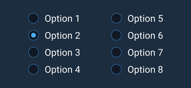
Radio Button
Radio Buttons allow users to select a mutually exclusive option from a predefined set of options. When one selection is made, the previous selection becomes deselected. One option should always be selected.
Rules of Thumb
- Use Radio Buttons for mutually exclusive choices. If the user can make more than one choice, use Checkboxes instead.
- Radio Buttons appear in groups of two or more.
- One option should always be selected. If a user is required to make a choice between items without a default, consider a Select Menu.
- Use Radio Buttons when two to six choices are available. If displaying more than six items, use a Select Menu.
- Don’t use a Radio Button to initiate an action. Actions can be initiated with Buttons.
- Don't use a Radio Button to initiate an immediate state change. Use a Switch instead.
- Lay out lists of Radio Buttons vertically with one choice per line.
- Accurately label a group of Radio Buttons to describe the choices.
- Give each Radio Button a text label that describes the choice it represents.
- If you use more than one word in a text label, be sure to use sentence case capitalization.
Appearance and Behavior
A Radio Button consists of a small circle that is filled in upon selection. Text describing the represented choice for that line goes to the right of the selection icon. If the Radio Button choice is disabled, the selection state is still indicated by the fill of the selection icon, but the choice is not interactive and cannot be selected. The disabled state is shown with lowered opacity compared to the enabled state.
Help Text for individual Radio Button list items left-aligns with the item’s text and not its icon for easier text scanning. To learn more about adding Help Text to Radio Buttons or Radio Button groups, see the Forms and Validation guidance.


