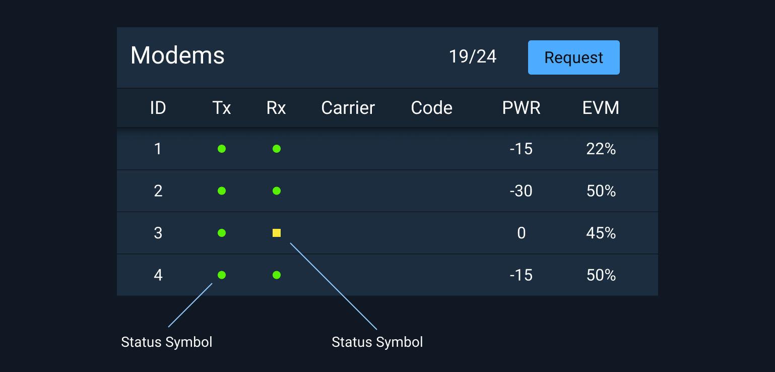
Status Symbol
The Status Symbol combines color and shape to create a standard and consistent way to indicate the status of a device or feature.

To ensure compliance with WCAG 2.0 contrast specifications for non-text content light themed Status Symbols must have a 1px black border set to 50% opacity.
Rules of Thumb
- Use the standard set of Status Symbols provided.
- Only use the provided colors for status.
- Use the highest color possible if multiple statuses are consolidated. For example, if the statuses of underlying components are green, yellow, and red, the consolidated indicator is red.
Adding a title attribute to status elements can improve accessibility by offering additional information about the status when the user hovers over the element or when used in conjunction with a screen reader.
Place your cursor over any Status Symbol above to see an example.
Related Pages
- For a detailed description of how Status Symbols are used within Monitoring Icons, see Icons and Symbols.
- To learn more about the usage of status colors, see Status System.
Status Colors
Status colors are provided for both light and dark theme versions of Astro in Hex, RGB, and CSS Custom Property values.
Dark Theme Status Colors
| Hex | RGB | CSS | Synonyms | |
|---|---|---|---|---|
 |
#ff3838 | 255,56,56 | --colorCritical | Critical, alert, emergency, urgent |
 |
#ffb302 | 255,179,2 | --colorSerious | Serious, error, warning, needs attention |
 |
#fce83a | 252,232,58 | --colorCaution | Caution, unstable, unsatisfactory |
 |
#56f000 | 86,240,0 | --colorNormal | Normal, on, ok, fine, go, satisfactory |
 |
#2dccff | 45,204,255 | --colorStandby | Standby, available, enabled |
 |
#9ea7ad | 158,167,173 | --colorOff | Off, unavailable, disabled |
Light Theme Status Colors
| Hex | RGB | CSS | Synonyms | |
|---|---|---|---|---|
 |
#ff3838 | 255,56,56 | --colorCritical | Critical, alert, emergency, urgent |
 |
#ffb302 | 255,179,2 | --colorSerious | Serious, error, warning, needs attention |
 |
#fce83a | 252,232,58 | --colorCaution | Caution, unstable, unsatisfactory |
 |
#56f000 | 86,240,0 | --colorNormal | Normal, on, ok, fine, go, satisfactory |
 |
#2dccff | 45,204,255 | --colorStandby | Standby, available, enabled |
 |
#9ea7ad | 158,167,173 | --colorOff | Off, unavailable, disabled |
In light theme user interfaces all symbols indicating status must include a 1 pixel border set to black with an opacity of 50% to meet WCAG 2.0 Contrast Compliance.
