Theme
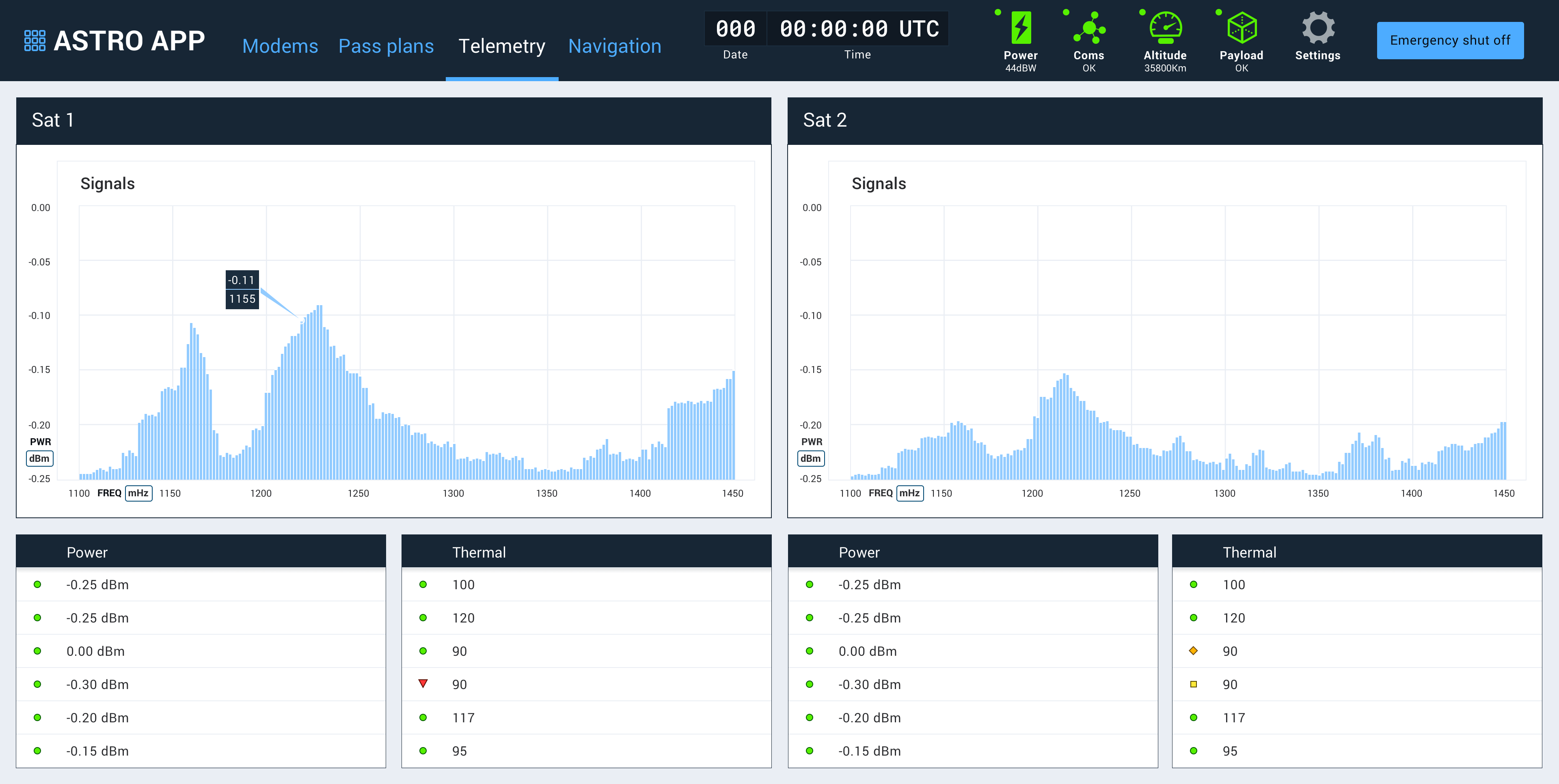
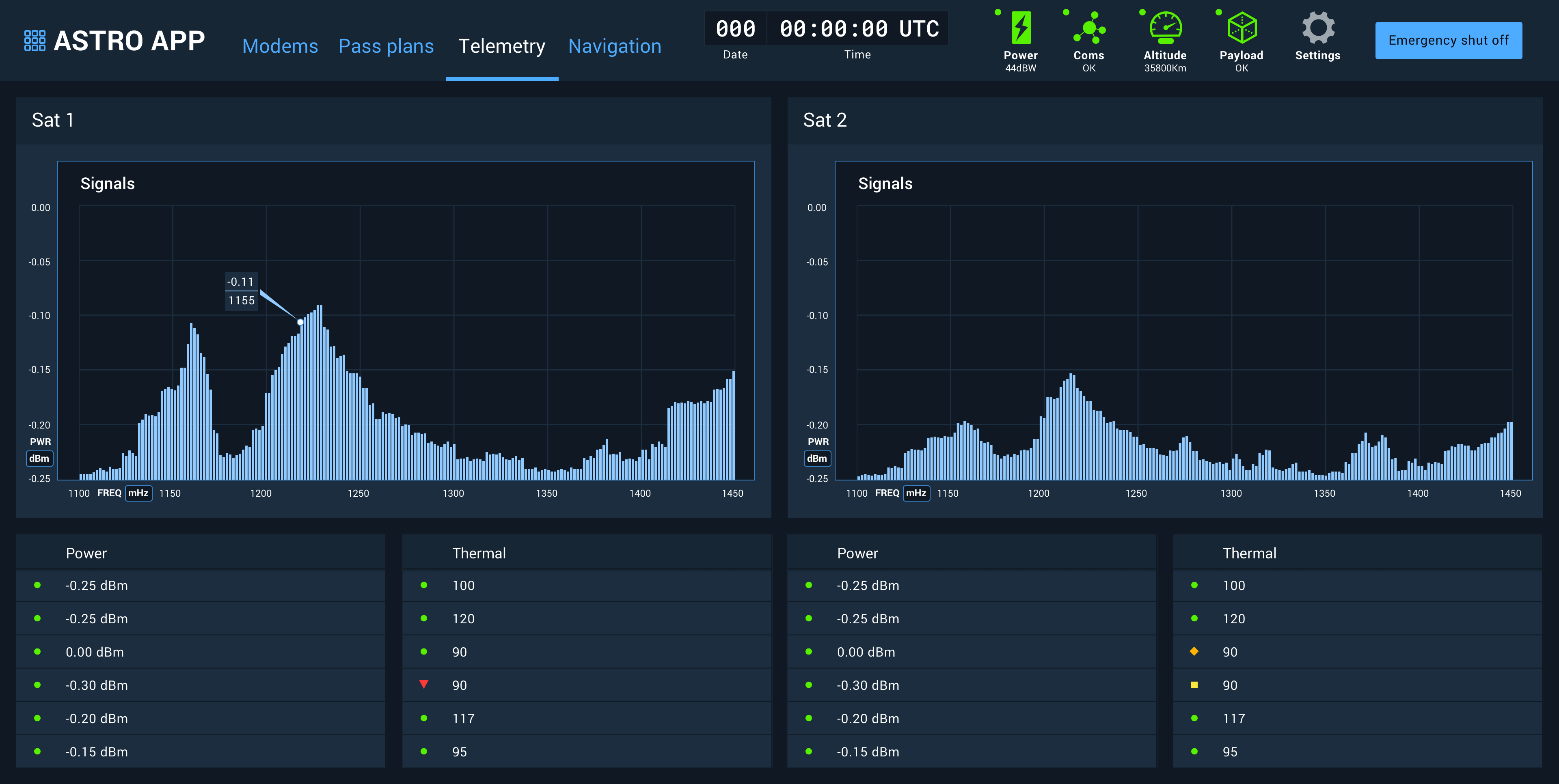
Astro supports a light theme along with the original, default dark theme.

By convention, the Global Status Bar and its enclosed elements will always use the dark theme styling.
When to Use Light vs Dark
It is important to determine the users’ environment and select the appropriate theme. In low-light operating environments where users’ pupils expand to allow more light to enter the cornea, a light-themed UI can be glaring and cause eye strain. Conversely, in a bright operating environment where the pupil contracts, letting less light in, dark-themed UIs can lose distinction and readability.
Light Theme Use Cases
- Outdoor environments
- Brightly lit operating environments
- Elements with long passages of text
Dark Theme Use Cases
- Dark operating environments
- Projection on large screens
- Applications where a primary media element demands attention

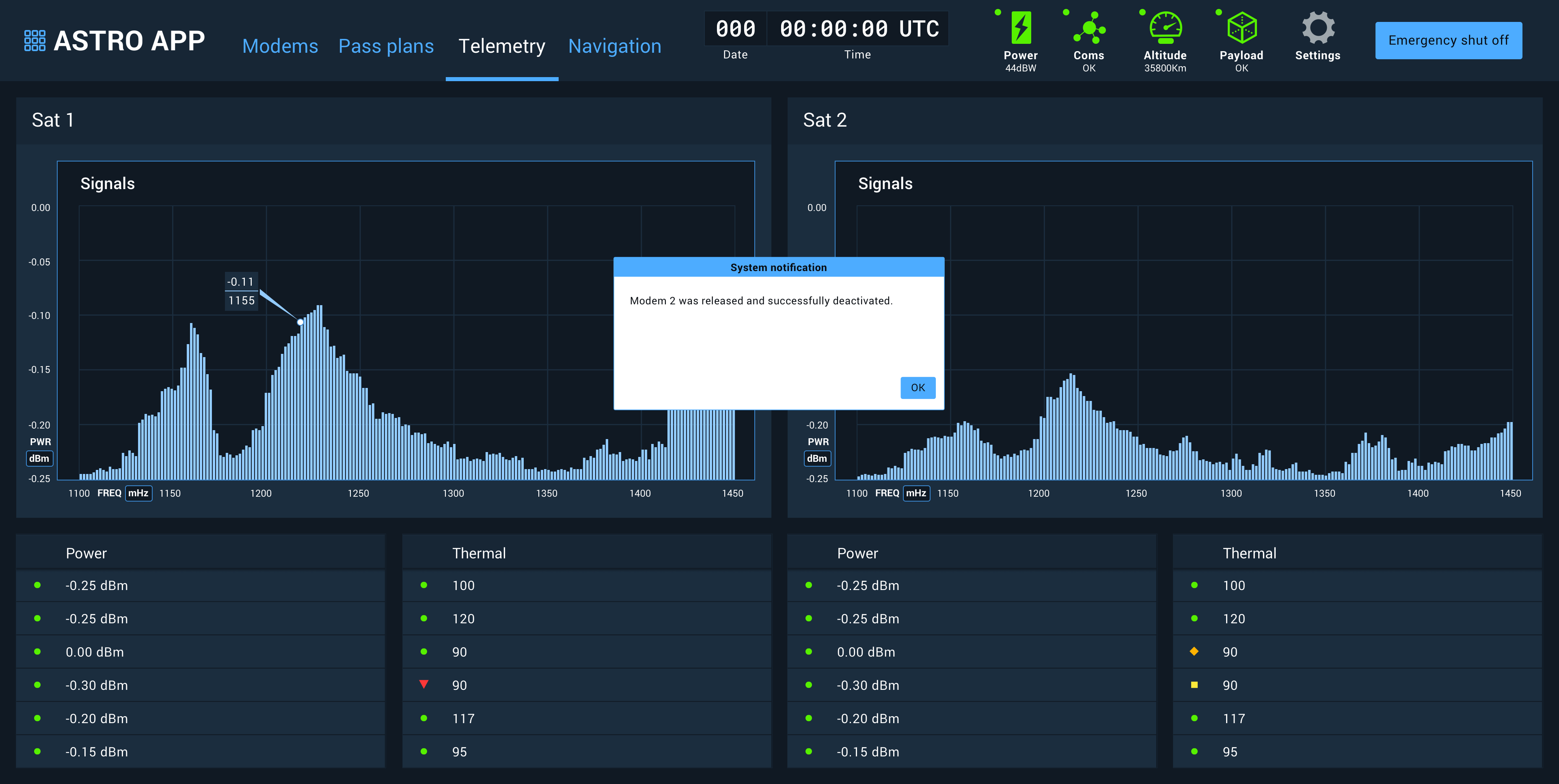
Mixed Use
Individual sections or components can override their inherited theme on a case-by-case basis, enabling the render of an element with a light theme in an predominantly dark-themed interface and vice versa. Examples:
- Dark-themed elements in the Global Status Bar
- Light-themed modal window in a dark themed app

Future Considerations
While not enabled by default at this time, light and dark themes can be swapped at runtime. For situations where lighting conditions can vary considerably, consider enabling runtime theme switching. A user-definable switch in the application settings, an ambient light sensor, or respecting OS level dark/light theme settings are all viable options.
Implementation
Astro applications using the Astro CSS Library will default to the dark theme with no additional involvement by the developer. To enable the light theme with the Astro CSS Library, the <body> element of the application should be given a light-theme class (e.g., <body class=“light-theme”>. For all other applications, refer to the Color Palettes for specific hex/rgb values in light and dark UIs.
