Forms and Validation
Forms
Forms are used to collect, validate, and submit user input. They usually contains form elements including Checkbox, Dialog Box, Select Menu, Input Field, Radio Button and Switch.
Form Layout
Forms should be designed in columns as this improves scanability. When there are not a lot of fields, a form should be one column. Information can be presented in multiple columns if they are grouped together.
One-column layout is preferred, but use two to four column layouts when:
- There are too many components to fit in an area of the page
- Specific fields have strong associations.
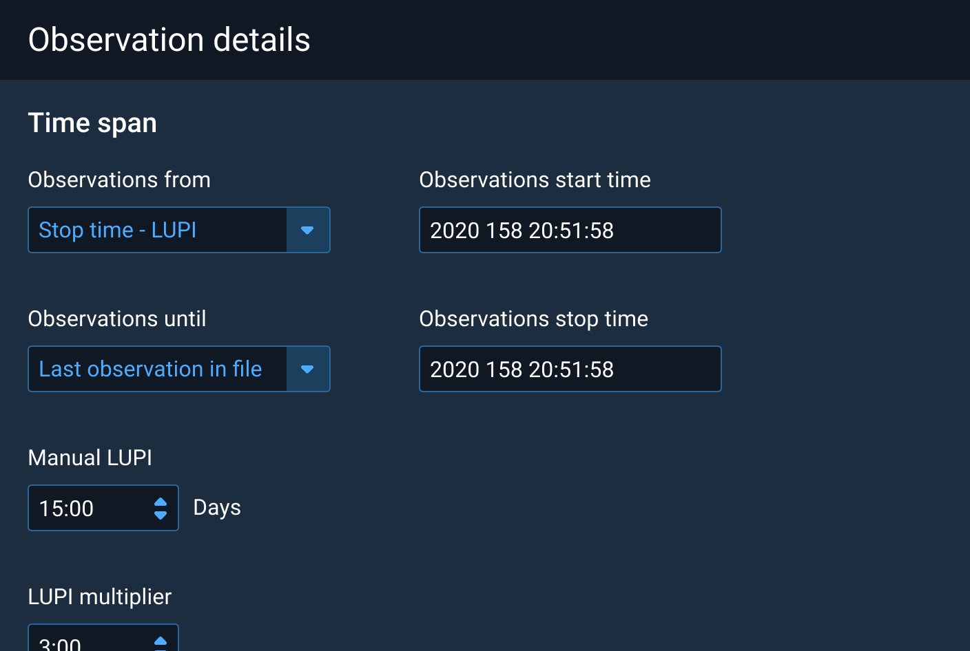
Form Spacing
Labels
Labels should use clear but concise language and provide enough information for the user to accurately complete the required information.
In general, labels should follow the vertical format of the Form. Place labels above their respective fields and align with the left edge of the Form element. If the Form has a limited amount of height available to it, labels can also be placed to the left of the field as long as the placement of labels is consistent within the Form. Either way, group a label with its field so that there is a clear distinction between fields.
Rules of Thumb
- Disabled elements don't get focus via click, tap, or keyboard, aren’t accessible when tabbing, and are not submitted with form data.
- Read-only elements (e.g.,
<input type=“text” readonly />) should allow focus via click, tap, or keyboard, are accessible when tabbing, and are submitted with form data. - Generally, the size of the control should match the length of the expected content.
- Use help text to provide validation support, rather than placeholder text.
- Do not use placeholder text for information that is vital to the user's understanding of the control. A placeholder will disappear once the control has focus, and it should only be used for short, clear, and generic instructions, such as using "Search..." in a Search field.
- Use required and optional indicators depending on their frequency. e.g. If more fields are optional, only mark required fields.
- When indicating required fields, an asterisk should be placed to the right of the label.
- When indicating optional fields, add the word "Optional" in parentheses after the label.
Help Text
Help Text is an optional component addition used to provide contextual or instructional information for a form element. Help Text content should be as concise as possible while still providing valuable information to the user.
Use Help Text instead of placeholder text when the user needs to refer to the instructional text after the field is filled in. Placeholder text should be used sparingly because the text disappears once the field is in focus, but can be used for generic information that is not required to complete the task. For example, including “Search…” in a Search field is acceptable since there are other cues about the functionality of the field outside of the placeholder text.
Rules of Thumb
- Be as concise as possible in Help Text content.
- Help Text goes below form elements.
- Use Help Text instead of placeholder text for important information.
- Use Pop Over instead of Help Text if the content overflows one line's width for that form element.
Appearance and Behavior
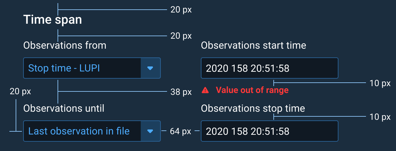
Help Text uses a smaller font size with the secondary text color so that it doesn’t take away too much focus from the main form element that the user should focus on. As usual, sentence case capitalization is used for Help Text for readability. Help Text is placed 10 px below the form element and is left-aligned with the beginning of that form element to make sure that it is clear which element the help content is related to. For Forms using labels above fields, this means that the Help Text would align with the start of the field’s label as well. For Forms with labels to the left of the field, the Help Text would only start with the form element, not the label, to make it easier to scan down the list of element labels without distraction. Two exceptions to this rule are Radio Button and Checkbox list items. In these cases, Help Text for a particular item in the list will be left-aligned to the start of the item text and not the Radio Button or Checkbox icon. This improves readability of the list. If the Help Text is relevant to a group of controls, like a group of Checkboxes that requires one selection, then the Help Text can go below the full grouping, left-aligned with the element’s label.
Like labels, in general, Help Text should only have one line of text below a field. If the text would need to wrap to a second line, use an icon that triggers a Pop Over on-click that contains the help content instead. This reduces scrolling and user distraction from the main content, the form elements themselves.
Examples


Validation
Validation ensures that data is properly entered into a form or form element. This includes both validation of input within required form elements and invalid data such as going over a character limit. Form validation should provide information about what and where the error is as well as how to make the necessary corrections, if possible. Validation can take place inline after a specific form element loses focus or after submission of a full form. Both can take place in the same form.
Input Fields, Checkboxes, and Select Menus can be configured to require user input and to enforce specific data formats. Once configured, these elements can provide validation as users move through a group of controls, such as a form, within a Dialog Box or Pane. Validation is then employed a second time when a form submission Button is pressed.
Individual elements outside of a Dialog Box or Pane can also be configured for validation.
Rules of Thumb
- Validate user input immediately after the element loses focus when possible. Don’t wait to validate elements upon “Submit.”
- Don’t reset the Form. Requiring users to re-input valid data is poor user experience.
- In the same voice, write short, simple, and precise error messages that assist users in easily correcting input errors.
- Clearly mark required fields with an asterisk to the right of the label when the majority of a form is optional.
- Clearly mark optional fields with (optional) to the right of the label when the majority of a form is required.
- Display examples of correctly formatted data. When validating data format, use placeholders and Help Text to clearly convey to the user the expected data formats. Automatically format data when possible and appropriate to avoid user errors.
- Use appropriate input type on form fields for the expected data input (e.g.,
<input type="number">when entering numeric data).
A well written validation error message greatly reduces the user’s error recovery time and boosts user’s confidence in the quality of the application. The error message should inform the user as succinctly as possible:
- What the input problem is.
- Why the input was deemed invalid.
- How to fix the input error.
Writing in the Astro Voice
The voice of Astro applications is direct, confident, and reflects the critical nature of Astro events and processes. It’s never chatty or informal nor does it personify technology.
Tips for writing validation error messages in the voice of Astro:
- Choose language that’s simple, brief, and commanding. Astro users are often in high-pressure, time-sensitive situations with only seconds to correctly respond. Therefore, only include information absolutely necessary to swiftly resolve the error.
- Omit pronouns. In error messages pronouns add no value and take up already limited space. Pronouns also assume an intimacy with the user making the message seem less formal and less important.
- Never personify the application. Assigning human qualities to a virtual environment is the parlance of Science Fiction. It’s inappropriate for the vital nature of Astro applications.
- Don’t use salutations. Leave out: “hello", "goodbye", "welcome”, etc.
Appearance and Behavior
For inline validation on specific form elements, Validation Text follows the same guidelines as Help Text in terms of general appearance and location. The font is the same medium font size, 10 px below the form element or group, uses sentence case capitalization, and lines up under the left-edge of the form element or form element group in the case of Checkboxes or Radio Buttons. If Help Text is present at the same time as an error state, the Validation Text replaces the existing Help Text under that form element.
The validation-specific appearance elements are a red border around the relevant element or grouping, use of red, bold text instead of secondary text color, and starting the text with a red warning icon. This provides the user with multiple cues about the error state to aid in accessibility. The bold text enables accessible color contrast levels between the text and background colors.
For post-submission errors, a Notification Banner or in-page message can be used to show more general information such as an error count or a general error message for the form or page.
Examples
Examples of configuration options for validation of Input Fields:


